Portfolio(2 / 157)

Love.irish pattern library and design system

2025

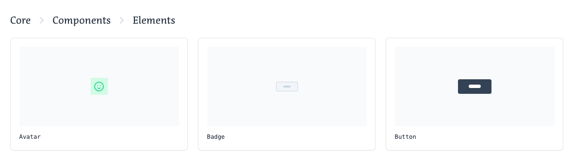
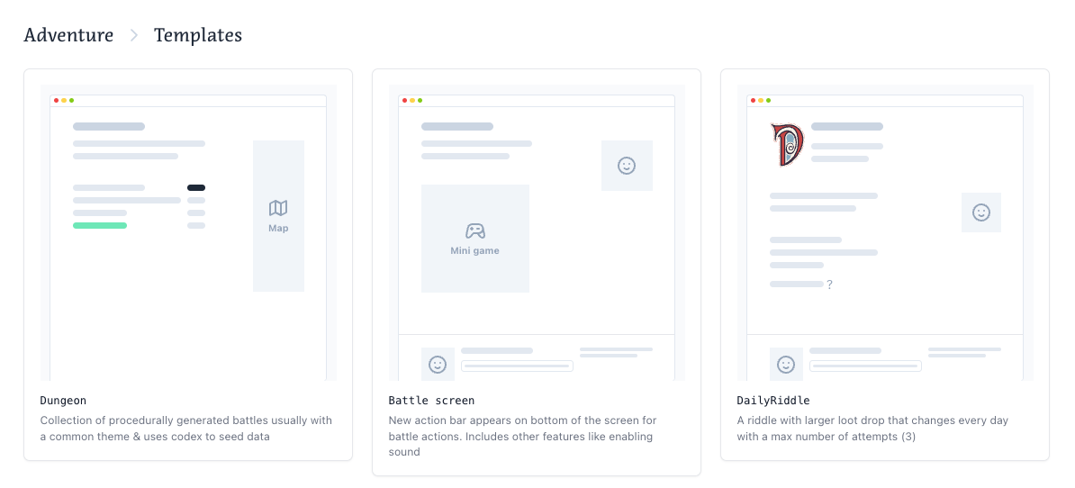
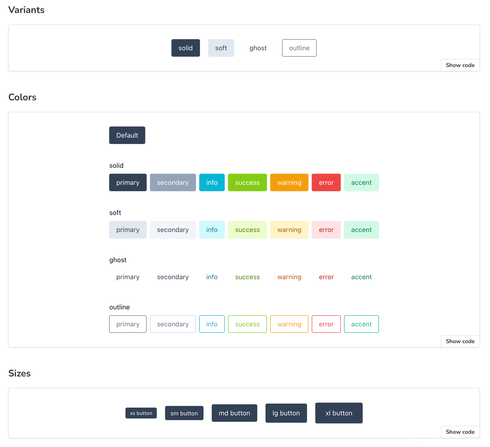
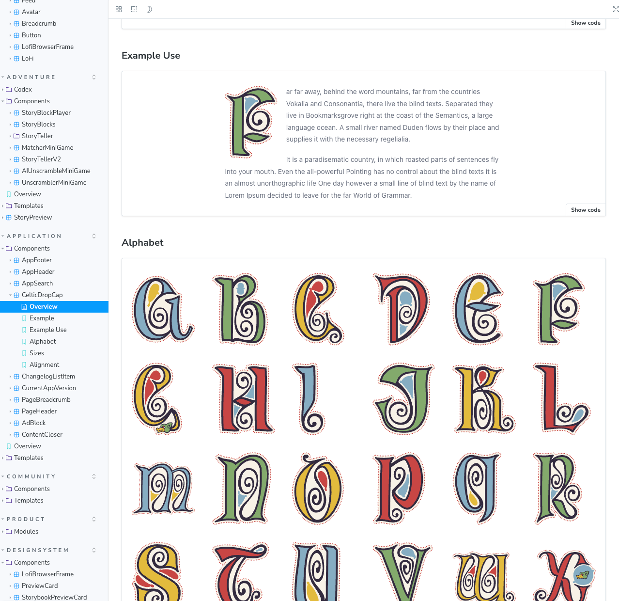
100+ components and patterns built to create a consistent experience across the Love.irish app and website. Follows the atomic design methodology including everything from buttons, dropcaps, content to templates and built using React, Tailwind CSS and Storybook.

I talk more about this in my blog post about design system strategies. I have also included more details here about the components specifically.

  • Design system includes components, modules, templates and hooks to quickly build new screens and organized into namespaces like core, application, community, resource, adventure.
  • Uses system generated types from the server from GraphQL packaged in @love-irish/types to add another layer of validation to make sure fields exist. Common queries are also published in @love-irish/graphql-api
  • Every component exports a preview component which can be used in places like Storybook documentation or in the app
Screenshot of a page from the Love.irish design system for the Dropcap component
Example of <Dropcap /> component used throughout Love.irish and supports different sizes

Components

The smallest building blocks which are typically "dumb" components where only presentational functionality is included like formatting text or exposing APIs to use when building larger patterns. These don't make requests or use too much logic that restricts composability or flexibility where things like modules or templates do.

Screenshot of the component Storybook page
Screenshot of the Button component Storybook page
Example Storybook page of the <Button /> component

Templates

The largest building block which includes pre-made screens and some include queries or have complex logic to handle logged in users.

Screenshot of the template Storybook page
Screenshot of the DailyRiddleTemplate Storybook page
Example of <DailyRiddleTemplate /> with support for dynamic NPC character, casting spells, tracking state and more